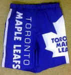
I am embarrassing myself for the sake of a visual and innovative tennis shorts design in these Toronto Maple Leafs shorts, so I hope you appreciate it! 🙂
 A few years back, I got a bargain at a discount fabric store Queens, New York City. They had 6 yards of Toronto Maple Leafs broadcloth they were willing to sell to me for $5 (see picture at right). Worse than hating the Leafs, I didn’t care about them. However, being from Canada, I knew someone was going to want it, whether as the fabric or garment I might make for someone as a gift. Never mind the $5 for 6 yards of fabric, but the Leafs logo and colours on it meant it was money well spent!
I finally got around to using this fabric today in a new tennis shorts design I had where there would be just one pocket, leaving the other leg piece to be large enough for that full Leafs logo to be shown in full. I’m a small person, you see, at 5’2″ and 108 lbs so it’s not like the thing would fit on many places on me besides the back of pajamas or casual shirt. And I was NOT going to be wearing a full on Leafs emblazoned shirt around!
Shorts are a little more secondary to a look, and I also wanted to see how broadcloth shorts would be like for playing tennis in since it soaks up sweat and might chafe. I had been making shorts out of spandex (DRAGON and POISON tennis shorts), but I have rather limited spandex opportunities available. They also don’t hold their shape well for casual wear when you’re still a lot of the time and people get a good look at them. In action or after action, people can imagine them looking better under more regular wearing conditions. So this was the perfect chance for me to try something with this Leafs fabric, even if I’ll have to embarrass myself a bit every time I wear them!
- Front
- Back
- Right Side
So what is it about these tennis shorts that make them innovative? In a word, pocket. That would be singular pocket, not plural.
In tennis, you sometimes keep a ball in your pocket. Usually, it’s when you’re serving, in case you need to do a second serve, which happens often enough, even for the pros. In doubles, you sometimes keep a third ball in play with you as your partner has two for serving already. Regardless, when you do, most people pretty much keep the ball in the same pocket all the time. But if you do, why do you need two pockets?
One pocket would not only eliminate bulk, but also a seam on the side without the pocket if you make the pattern to be straight on the side rather than with a little hip curve. It’s not like you’d need that curve cause the elastic waist band would pull the excess in anyway. Unlike pants, you would wear a top over that waist band, reaching down to where your hips are widest, at least, so you wouldn’t have to worry about losing form fitting shape above your hip line. Without that seam, you can do so many continuous prints and/or images for the side without the pocket that it opens up a whole new design option for you!
Now, you might ask about maybe keeping keys or money in your pocket? I don’t recommend it during tennis, but if you must, or when wearing as casual shorts, then try a pocket with a slanted bottom (see picture at left).
I made a pocket with a slanted bottom so that gravity can set your keys in below the tennis ball, on the side of your pocket touching the side seam. The tennis ball will only go down as far as the middle of that slant. The rest of it slanting to the side will form a little triangle perfect for your keys! They will also be away from your skin, relatively speaking, rather than constantly against it and rubbing to chafe you.
There are other practical benefits to this pocket, including strength and durability. I’ll write about that tomorrow in a separate post dedicated to the slanted pocket.
Finally, for the rating. These shorts were sewn very well. The design is practical and innovative, not to mention cool with the logos and wording. However, it is the Toronto Maple Leafs on the design. So for that, I’ll downgrade the gold rating I would otherwise give it to a silver. The Leafs don’t deserve a gold in anything! 😉
Please click here to see other garments I’ve made and fashion related articles I’ve written.


