I had such high hopes and good intentions for this project. Then I overdid things and got a marginally acceptable garment… for now.
When Peyton Manning got traded to the Denver Broncos, they became my favourite team since I was only attached to Indianapolis Colts for Peyton. I also used to love the Broncos when John Elway played so it wasn’t a big adjustment. As I started making clothes, I knew I had to make something with the Broncos aside from stuff like pajamas that few people would ever see. When I found some Broncos fleece last November in Los Angeles, I was delighted and plotted despite the print being a bit busy. Still, I could make a fun casual fleece coat, lined with anti-static Bemberg lining to keep me from being electrocuted and break the wind so common here in Halifax, to keep me warmer.
I tested the execution part of my idea with New Orleans SAINTS fleece in this coat (for which I’ve added updated photos with new features). I was now just going to do one with the Broncos dark blue fleece with white yoke that was flat rather than V bottomed like the SAINTS coat, and it’d looked cool. But as is my nature, I improvised as I went and added features I thought would make it look better. First came the white cuffs, then orange epaulettes, then the Broncos logo on all of them, then my brand name and logo on the front yokes since there were enough logos already. Next thing I knew, though, the whole thing was way too busy! It also contrasted because the print was very casual, almost like pajama prints. Yet, the epaulettes and cuffs with logos were militaristic. You couldn’t get two more different feels!
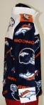
And then there was the execution. I could have executed a few things during the making of this coat! For one thing, my serger ate the collar that I had to not only take it all apart, I had to make a new collar on a bigger hole! However, I wasn’t about to remake that logo on the back which I had cut out from a vector file and layered felt squares on top of each other, right down to the pupil in the eye! This not only meant the collar would be bigger, but that also everything that had been lined up was now slightly offset. For example, I had an equal distance on the back logo between the bottom of the yoke and where the original collar would have been (see logo enlargement at bottom). However, I lost about half an inch at the top, and suddenly, it was no longer vertically centred. Same with my brand logos on the front yoke. The symbol logo was further offset with the epaulettes taking up some vertical spacing, having been lined up with the baseline of the type logo.
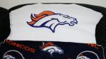
The Broncos logos on the epaulettes and cuffs were from the fleece print itself. It was too small for me to make well out of felt squares like the huge back logo. Unfortunately, being a little 5’2″ guy, they were a bit big for the garment. I pushed my luck to use them so they are a bit garish and are not indicative of my design abilities, just a little poor fashion judgement every now and then. But you know what? If I made this jacket for Peyton Manning in his size, those logos would be the ideal proportion. Maybe I should.
Regardless, for me, there’ll probably be a remake next winter. I need to focus on other garments for now. In that remake, though, I will not be using the Broncos print. I’ll just be using some dark blue version and go for the militaristic look. I’ll also make it a better fit as this size is just a tad big for me. It’s fine with its busy look making it casual in nature so I can have a casual look. Hell, like 90% of the people out there don’t exactly wear sharp well fitting clothes, so I’ve got to learn not to worry like I once never did. But when it comes redo time, I’m going to be Napoleonic to get it right!
Please click here to see more of the fashions I’ve designed and made.
-
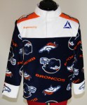
- Front
-

- Back
-
- Side
-
- Back Logo enlargement Before completion
