 From my experience, when you share a WordPress blog post on social media, the icon that appears with the preview (when there is one), is a thumbnail of a graphic in the following priority order, pending what you have or don’t have with your post:
- Designated featured image; then
- First or only image embedded within post; then
- Blog profile icon that is also the blogger’s profile icon.
The first and second option would require an image to be associated with each post by being designated as a featured image, embedded in the content, or both. Different blog layouts treat the two image usages differently so any of those options may, or have to be, used. Otherwise, one should have a blog logo or picture to represent posts without a picture, or else the thumbnail on social media would be that of a head and shoulders icon.
Given the diversity of the content on this blog, which I had known there would be from the beginning as it was my one of my great tech, life, writing, and other experiments, I didn’t try to design a logo for it. That’s somewhat ironic given I used be a graphic designer who loved to design logos most, especially logos to fairly represent challenging concepts, ideas, entities, etc., and I still do. It wasn’t useful at the start back in 2009. Then there were a lot of visual content that supplied all the images required. But now, and in the next couple of years, I see myself writing a lot of posts that is just writing, and maybe some documentation of things like my new year resolutions progress as an occasionally recurring topic. As a result, I need a logo for this blog.
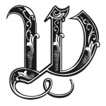
 I say I need a logo for this blog because up to now, I’ve been using my profile icon that is essentially a computer green digital representation of the character Neo, in the Matrix, removing his glasses, against a black background. It’s absolutely terrible for a logo as it was meant to be anything but that. Yet, despite the limited content diversity expected in the near future, with just the creative writing and occasional new year’s resolution updates, I still opted out of a logo design because of the past content. There will also be more diversity in future content, and there will be plenty of diversity for topics in the creative writing content. Instead, what I opted for was the concept of thumbnail “labels” for the creative writing and occasional new year resolutions updates. That is, I’ll have an icon that represents the nature of the several types of posts, not necessarily the post content itself, though the resolutions updates will be identical to its type. For example, that calligraphic “W” at the top right of this post that I found online, and the first image in this post, will be the thumbnail “label” for this Writing post, and all my Writing category posts. Meanwhile, the posts relating to resolutions will have the logo now attached to them that I quickly compiled.
For the most part, I’ll be the only one sharing my posts on social media, but I like how they’ll look when I do. I also like how they look visually on the blog, quickly letting readers scan the home / splash page for the nature of each post without having to read much text on them. They look like a bunch of envelopes with stamps on them, something that’s not nearly as common a sight these days as it used to be.
593 words
